UX and IA in card design
DISCLAIMER: The images shown below were AI-generated - and only used as placeholder art during playtesting.
Recently, I did a deep dive into the card design for my game 100 Nobles (releasing early 2026).
The game is a medium-weight hobby game and is more complex than what I usually design. Each card in the game has quite a lot of information - and fitting all of it onto the card in a logical way presented me with a challange.
During testing, I tried several different layouts, but never found one that felt right and so I decided to do a deep dive into the underlying information architecture (IA) of the cards.
Here’s the step-by-step process I followed:
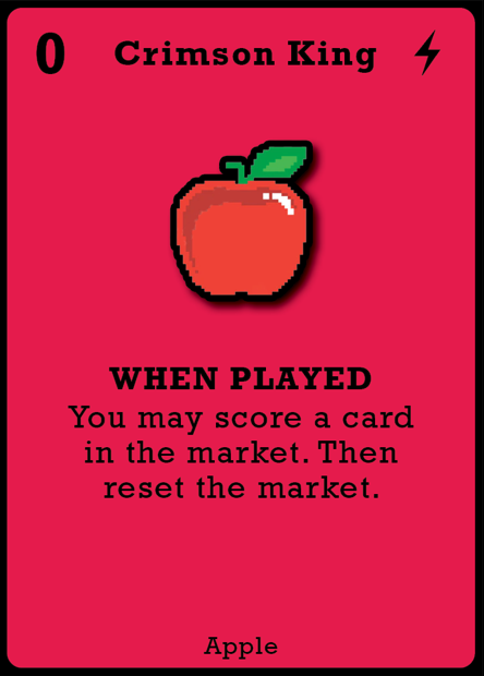
Firstly, I wrote a list of all of the elements on the card I could see:
An image - helping to visually define the card’s ‘type.’ To clarify, each card with the same type had the exact same image at this stage.
A background colour - also helping to define the card’s ‘type’ - same as above, each card of a given type had the same background colour.
A point value - “0” in this example (top left corner)
A card name - “Crimson King”
An effect type - the lightning bolt icon (top right corner)
Effect timing text - “When played” in this example
A card effect - “You may score a card in the market…”
Card type text - “Apple”
A card border - a black card border
Next, I set about trying to rank each card element in terms of its importance on gameplay.
The idea being to approach the design with that lense - the “number 1” most important element would feature most prominently, then the “number 2” element and so on.
This was a tricky task. For example, is it more important to know when an effect triggers - or how many points a card is worth? Defining a clear priority of the card’s information that would apply across different game states and player types is ambigious.
Nevertheless, here’s what I eneded up with:
Card colour (visual indicator of the card’s effect type)
Points value
Effect type text
Card effect
Image
Effect icon
Card type text
Card border
Name
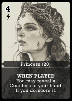
This was the next iteration - some steps forwards and some backwards.
One very large change you’ll notice is a new theme - royal Nobles plotting to take power from their rivals. Originally many of the effects in the game were very silly and the fruits theme was intended to help the players not take the game too seriously.
However, as the game evolved, the silly effects proved to be less interesting and more, well, silly. As they were removed, the fruit theme didn’t make sense and needed to change.
Another change here is the removal of card names, which had been a part of the game from the very first iteration. Card names ranked 9th in my list (above) and as such I removed them.
There’s a lot going on in this deisgn - and, frankly, it’s a bit of a hot mess. It’s difficult to know where to look - with multiple elements all fighting for your attention at once.
Despite my analysis, this iteration actually took some backwards steps:
A new element was added - the quantity of each card type “(20)” which did not offer the players much value at all. The point of the IA was to simplify and prioritise, but here I got distracted and added more noise, instead.
The card image, despite ranking 5th above was still the most prominent thing on the card. It takes up a very large percentage of the card’s real estate and is very eye-catching when compared to the other elements.
The next step was to delve deeper into how the cards are used during the game, which led to two key realisations:
In the game players have a small hand of cards - typically just two - and they play cards to their own tableau on the table in front of them (about 10-12 cards each). This led to the insight that the design should strongly prioritise the way it functions when on the table, as opposed to in your hand.
In the game players arrange them into a row based on their points value - as one of the interesting scoring mechanisms in the game rewards you for creating a sequence of numbers; i.e. 1-2-3-4 etc. Additionally, if you play multiple cards to your tableau with the same value, you need a way to stack them, such that you don’t take up too much table space, whilst still being able to see all key information.
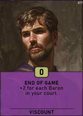
A big leap foward
The card border has been almost entirely eliminated
The card value (“0”) has been moved to the middle and bottom section of the card - and placed within a gold box.
The card effect icon has been removed.
The card type quantity has been removed.
A very small card reference number has been added - “017” although this was for game development purposes and was not intended to be part of the final layout.
The card feels a lot cleaner here and it draws your eye immediately to the cards value, then the card effect below, which is in line with the IA design.
This deisgn also allowed cards to stack on top of each other in the way described above (there’s an example later in this post).
The idea here was to use the cards colour to visually communicate the type of effect it had:
Purple cards were “end of game”
White cards were “immediate”
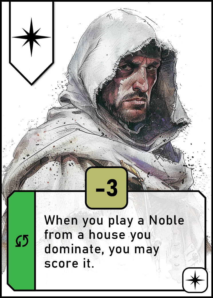
Green cards were “ongoing”
A key challenge still remained with this design, however. Effectively, each card still had two “types” that were competing for your attention:
The cards effect type - now visually represented as a colour.
The cards Noble type - in this instance, Viscount, which was only represented by the text at the bottom of the card.
The reason for both was that many of the cards care about one, or both of the card types that you collect. Some cards reward for you collecting "end of game” effects. Others reward for you collecting “Viscounts.”
Mechanically, the different types allowed for a wider range of card interactions. Visually, it made the cards harder to undestand.
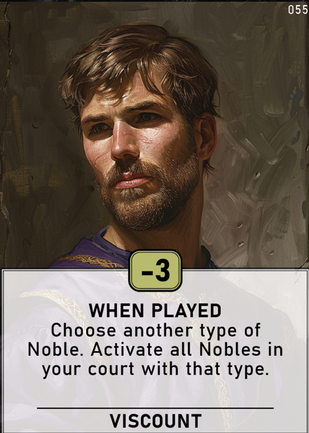
To illustrate the point, here is another Viscount, with a ‘when played’ card effect.
The white background behind the effect text helps you glance when the effect triggers.
But how then do you help players see that the card is also a Viscount? The solution here was to use a similar image for each (in this example it’s the exact same image as it was easier than trying to find lot of different artwork) and also through the use of the “Viscount” text at the bottom of the card.
This solution certainly worked during testing - but to me it still wasn’t quite right.
The next breakthrough came when I decided to tie together the card’s ‘Viscount’ type into a colour and icon.
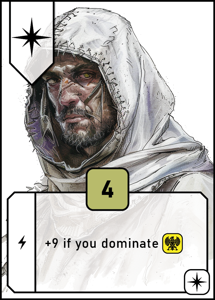
Each card now belongs to one six royal ‘houses’ - these replaced the need for words such as “Viscount” or “Princess” and allowed me to remove them from the game.
Not only could I remove it from the bottom of each card, but also in the effect text that referred to those cards. Instead, that is referred to now with the use of a coloured-icon (the yellow icon).
The artwork is similar (but not the same) for each card in the house and, importantly, prominently features the house colour. The man in the image is wearing a white robe and is set above a white background.
Each house colour is also reinforced with a house icon - in this instance a star. This is a great colourblind-friendly addition to a game (and I speak as someone who is colourblind).
So what about the cards effect timing?
The card timing still has a colour too - and an icon again - the balance was in designing the layout to be able to feature enough of a splash of that colour to be easy to glance - without it interfering with the card’s other colour.
And visually connecting that information to the effect that it related to. This was achieved by having it sit at the front of the card effect, in a coloured vertical strip - but still bounded by the box that contains the card effect to show that it’s related.
Green still represents effects that are “ongoing” (green means ‘go’) and for comparison, the above card is an ‘when played’ effect - represented as a solid white background, with a lightning bolt icon.
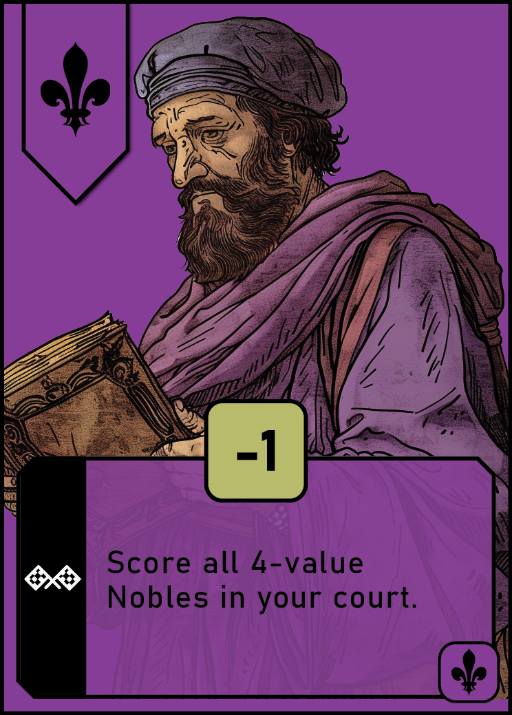
The final breakthrough was to separate all of the end of game effects into their very own house!
End of game effects are depicted with a black stripe and checkered flag icon as shown here. The white-on-black design was chosen as it is the opposite the black-on-white design of the ‘when played’ effects.
Further to this - I decided to have all end-of-game effects exclusively appear within the purple house. Each house in the game has a speciality - and that is theirs.
In other words; all purple cards are end-of-game effects and all end-of-game cards are purple. This gives players two visual ways to glance these cards during the game.
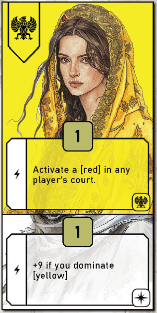
And lastly, here is an example of how cards with the same value can stack over each other - whilst still allowing players to see all key information at a glance.
The discovery I did during this part of the game’s design was immensely valuable to me - and I’ve been able to leverage many of the learnings in my current designs.
Let me know what you think in the comments below!